Concert for the Deaf
This was an experimental typography project that I did for my advanced typography class, and I would consider this my strongest piece of work. For this project, we were required to create a 3 poster advertisement series for a concert, a festival, or a convention. For the advertising, we were asked to use primarily typography that we create from real world objects, rather than typeset text.
My girlfriend is an ASL interpretation major, and she told me about deaf concerts where the floor of the room or arena is built specially so that they can feel the music through the floor, and some even wear special vests to feel the vibration of the music through their body. I thought this was an awesome idea so that is what I decided to base this project on.
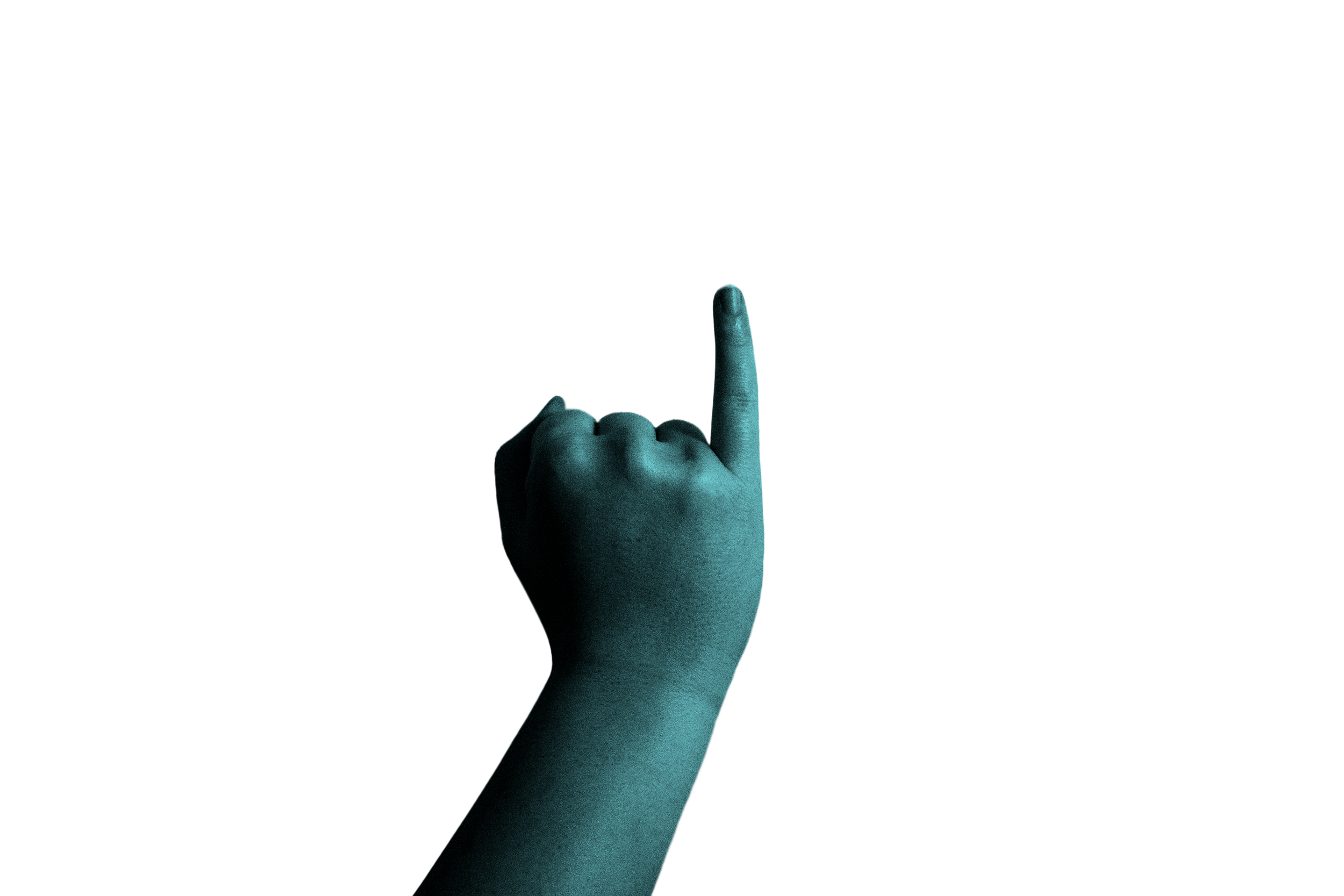
For my solution to creating experimental type, I decided to use the ASL signs for each of the letters to create the words on the poster, and overlay typeset text so that anyone can understand it when reading the poster. The first step was to have my girlfriend model all the hand signs for the characters that I needed for the poster. I needed 17 characters for the posters so that I could create one poster with the concert name and two posters showcasing the featured artists. The images below are the raw images I took and were my starting point for this project.


Process


The next step was to take all of the individual characters into Photoshop to isolate them from the background and change the colors to fit the theme of the poster. The colors were based on images from a deaf concert that actually happened and i wanted to simulate colored lights shining onto the hands without photographing them with colored lights. After isolating them from the background, I added a simple gradient overlay on top of the characters to add the colored light effect. The 3 blue characters were the ones used on one of the featured artists posters.


The next step was to create the background that the characters would go on. Again, I wanted to simulate shining lights, so I added a gradient background to each of the posters, 2 of the same darker blue and one lighter teal. I also wanted to add imagery to reflect vibration, since feeling the sound waves is the entire point of a deaf concert, so I created a custom vibration wave in illustrator to display in the middle of the posters. I created 2 wavy line segments in illustrator and used the blend options with a custom step level to create the waves.


After this , the only thing left to do was to pick a typeface for the overlay and information and then put everything together! I chose a very simple geometric sans serif typeface to not only make the design feel futuristic but so that the typeset text did not draw the attention away from the ASL characters. Before overlaying the text, I blended all the characters into the background to give them a smokey look by just using a transparency gradient, which also helped to make the typeset text more visible. Finally I overlayed the text, and the posters were complete!


I had a ton of fun making this project and it definitely helped me to step out of my comfort zone a bit and work almost exclusively in Photoshop. I used a lot of gradients, which I typically don’t use much, but I think helped to elevate this project to the next level and I got much more comfortable with selections in Photoshop, as well as learned some new things along the way. I look forward to more projects like this one in the future!