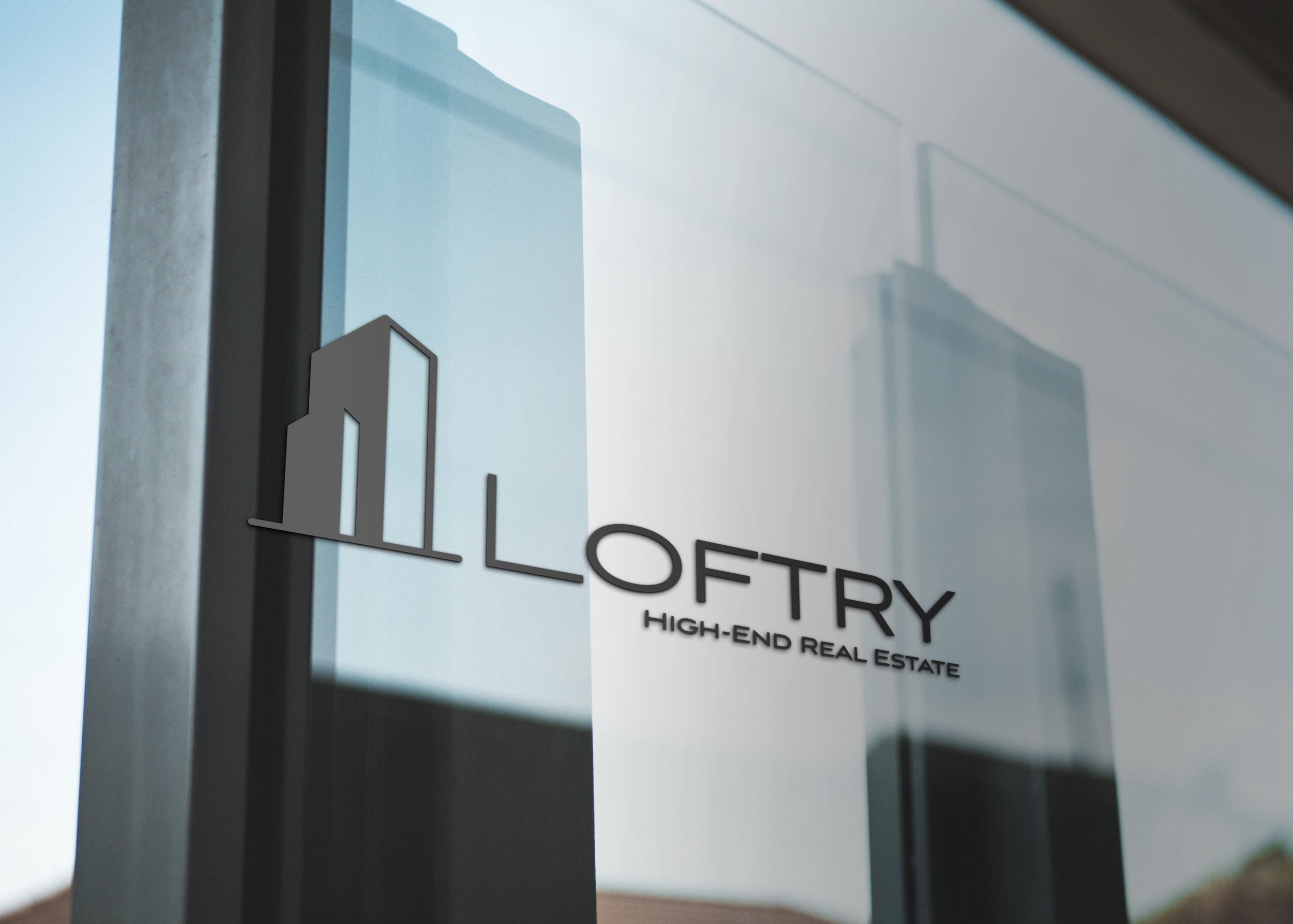
There were 5 primary goals listed in the client brief:
1. Studio/Loft or Furniture inspired icon
2. Custom type design within logo
3. High class and modern design
4. 1-2 colors for the logo design
5. Logo and branding need to function on and be applied to signage within the office and gift bags for clients, as well as an advertisement series for the LinkNYC boards.
The target audience was young professionals 28-40 years old, single or newly married.
Loftry
Loftry was a branding project I did based on a fake client brief. We were given a list of different client briefs and scenarios to choose from, and I landed on Loftry, a real estate company based in New York City. I partially chose this because I had never done any branding for a real estate company before and I wanted to stretch my abilities and try something new.
Average household income for the demographic was $240,000 - $340,000 per year. I went with a navy and gold color scheme to keep the color scheme simple, as the client requested, while giving the brand a high end feel. The simple illustration of the skyscraper combined with the thin, clean sans serif font gives the brand a modern, high class feel. I designed a real estate flyer to go on the LinkNYC boards as well as created a professional stationary package for the identity. Finally, I designed some key tags to add a unique touch to the brand and the collateral to give it a more personal feel.


